Fortune.com Subscriptions Page
When I joined Fortune, the subscriptions landing page had not been updated in over a decade. From a UX perspective, there were two main issues I needed to tackle: firstly, the subscription boxes were too tall, pushing most of the content below the first screenful on mobile, and secondly, there was no information whatsoever about the subscription tiers, which resulted in unnecessary customer service requests.
The visual challenges: the page lacked visual hierarchy, utilized off-brand fonts, and contained excessive whitespace without any imagery, which significantly weakened user engagement and conversion.
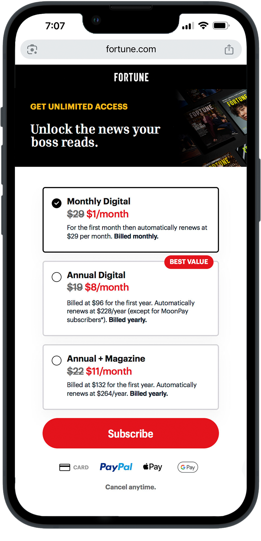
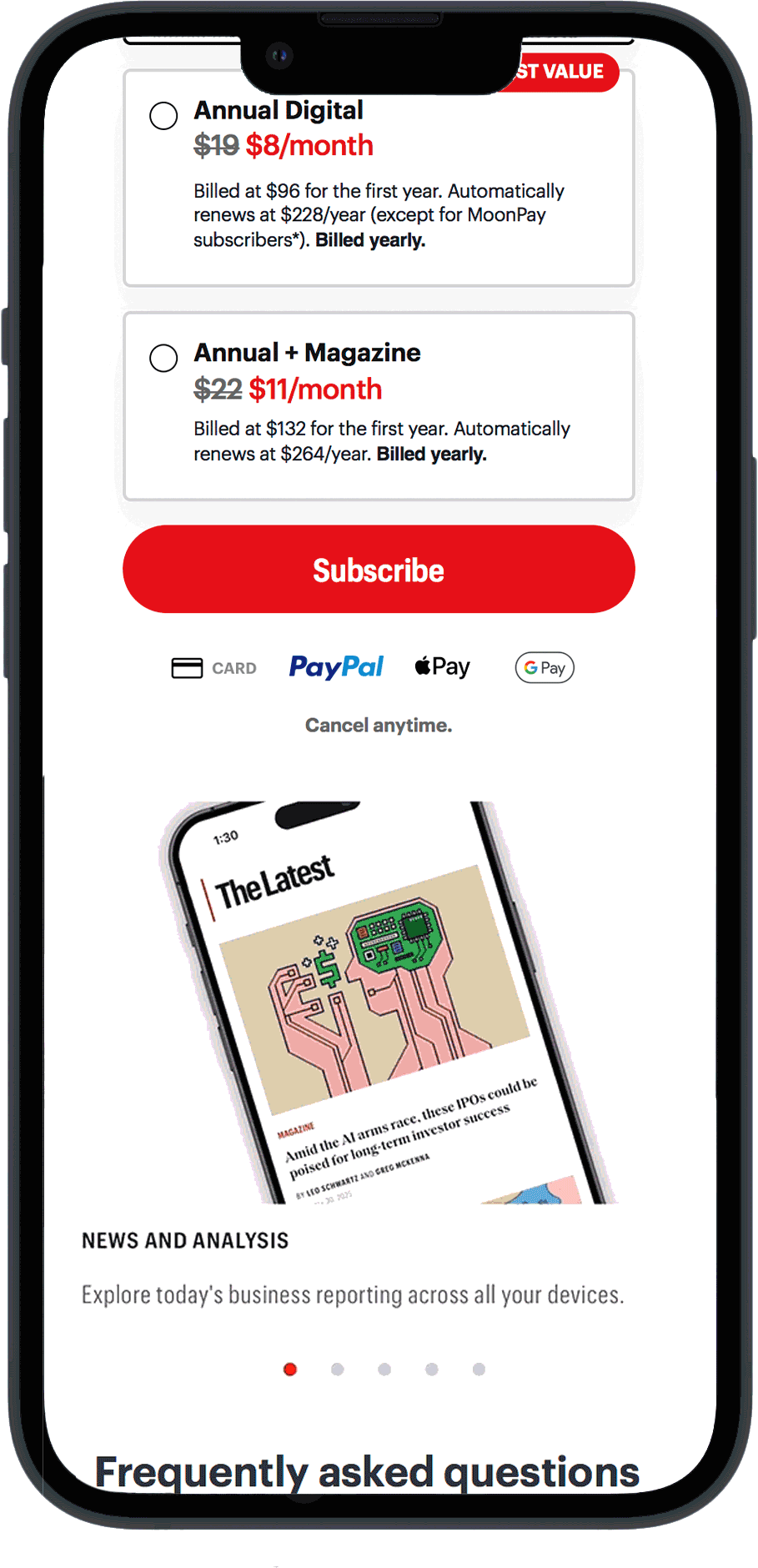
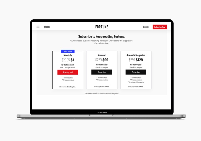
Using a mobile-first approach, I designed a new page from the ground up, incorporating updated typography, images, and a clear content structure to guide users through the decision-making process. The initial launch was mobile-only, with the A/B test yielding immediate results: a 10% increase in conversion rate (CVR), 25% increase in cash-in, and 7% lift in lifetime value (LTV) within three weeks.
MY ROLE
Art Director — UX/UI, Graphic Assets
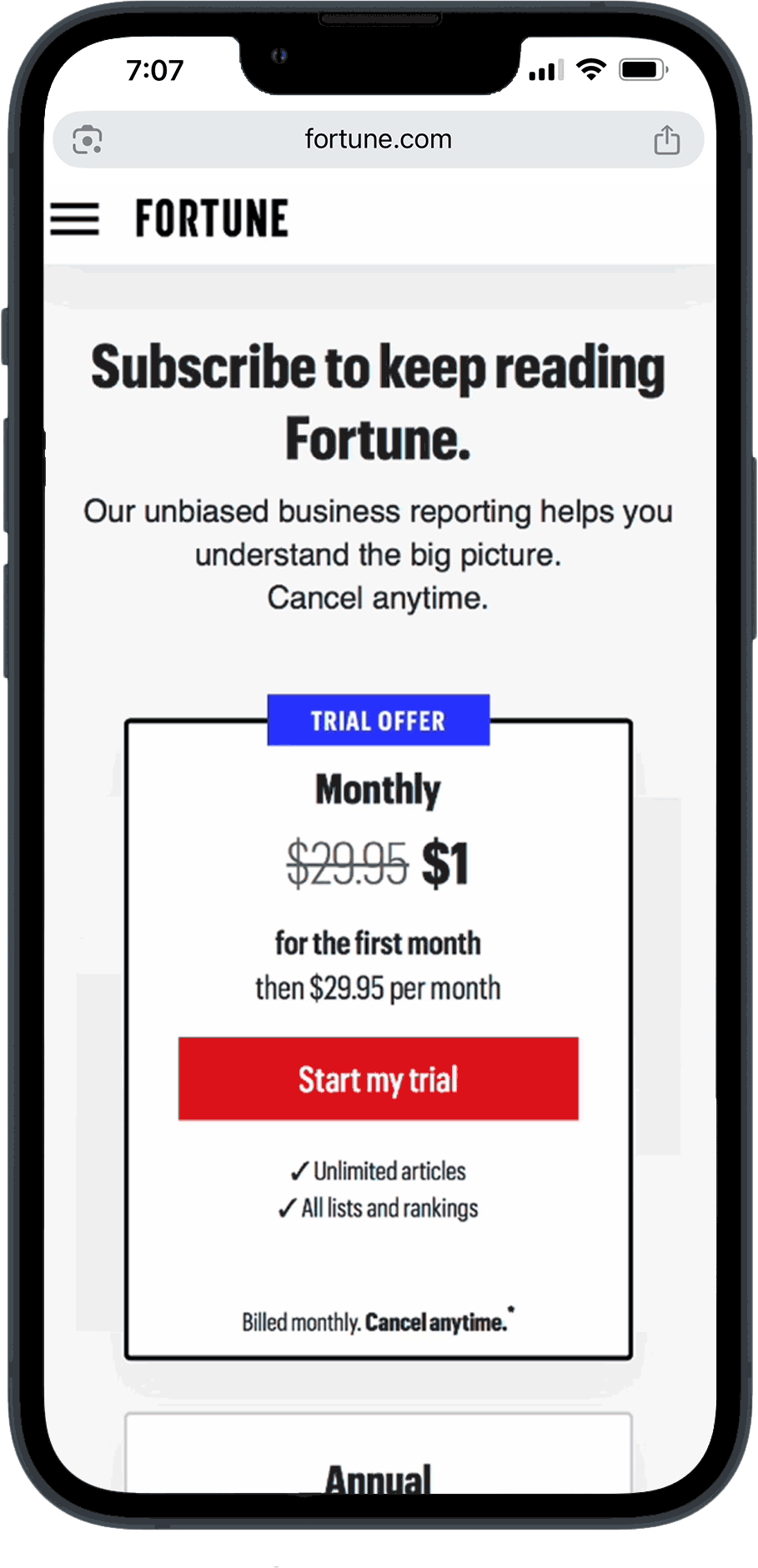
Before
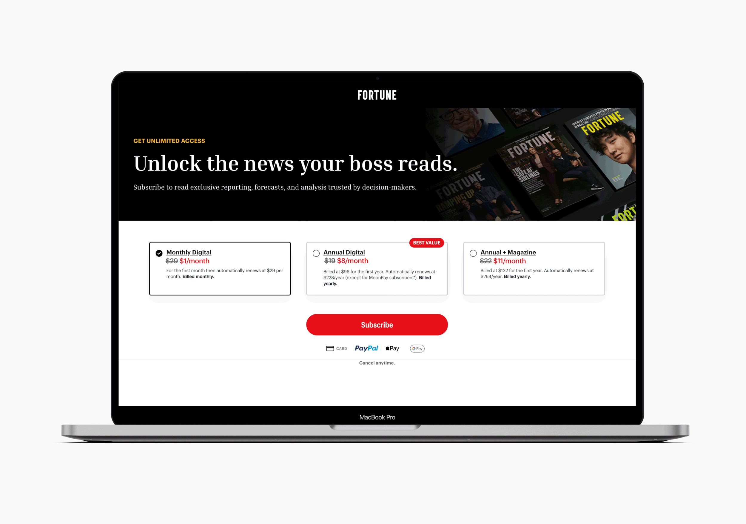
After

