SUBSCRIPTIONS PAGE
FORTUNE • 2026At Fortune, I redesigned an outdated subscription landing page with a mobile-first approach, focusing on clearer subscription tiers, stronger visual hierarchy, and a more intuitive user experience. The redesign modernized the page while reinforcing Fortune’s premium brand identity.
Within three weeks of the initial mobile launch, A/B testing showed a 10% increase in conversions, 25% increase in cash-in, and 7% lift in lifetime value (LTV).
MY ROLE
Lead designer — art direction, design, Q/A
Work completed at Fortune
THE CHALLENGE
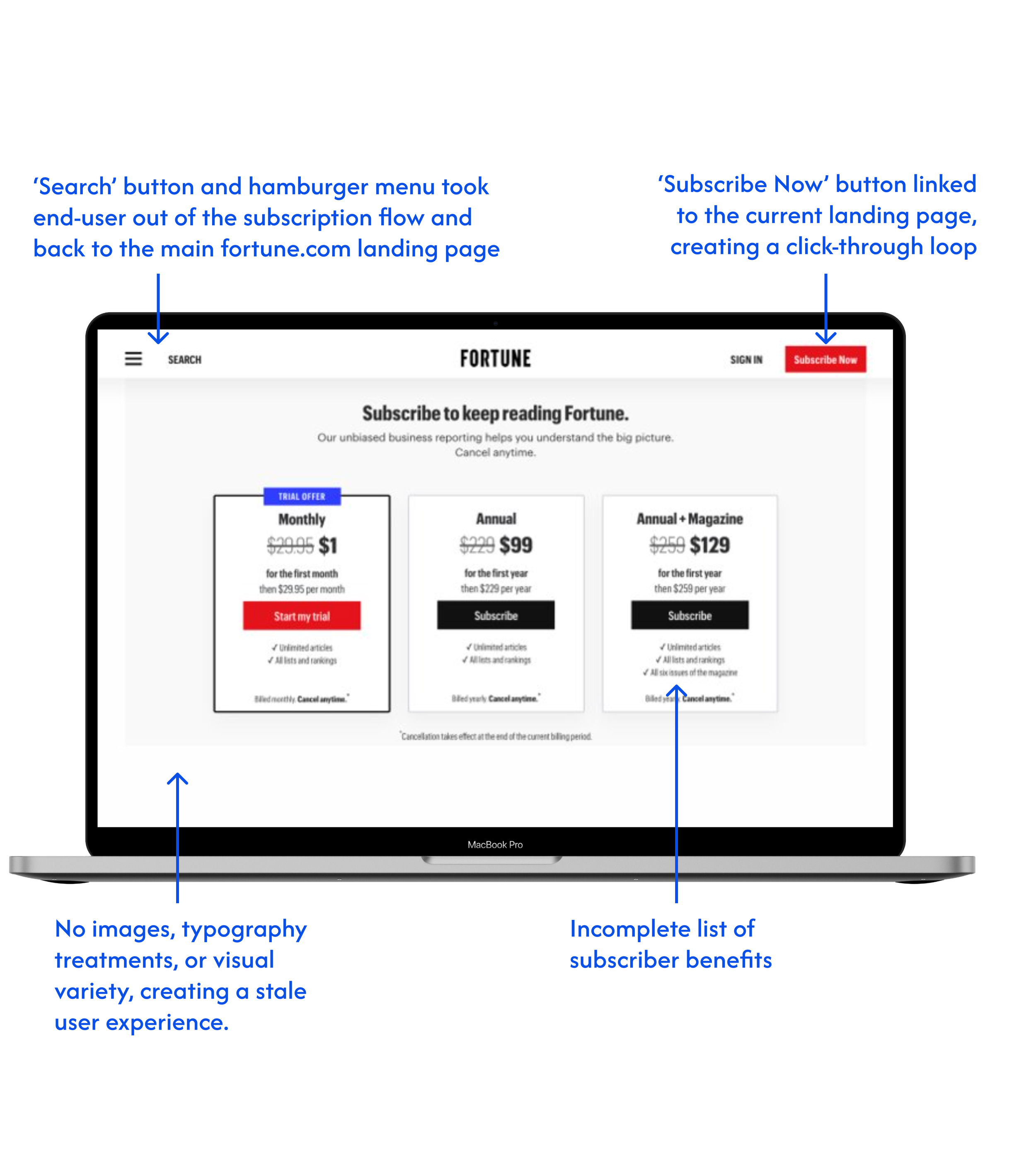
When I joined Fortune in 2025, the newly-formed Consumer Marketing team inherited a landing page that hadn’t been updated in over a decade, which was hurting subscriptions. We needed to come up with a new design that communicated Fortune’s prestige amongst its competitors and made it stand out.
From a UX perspective, there were two main issues I needed to tackle: firstly, the subscription boxes were too tall, pushing most of the content below the first screenful on mobile, and secondly, there was no information whatsoever about the subscription tiers, which resulted in unnecessary customer service requests.
The visual pain points: the page lacked visual hierarchy, utilized off-brand fonts, and contained excessive whitespace without any imagery, which significantly weakened user engagement and conversion.
THE APPROACH
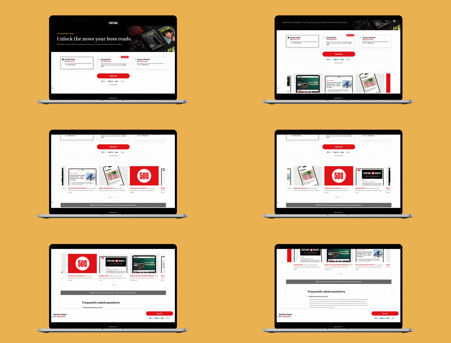
Using a mobile-first approach, I designed a new page from the ground up, incorporating updated typography, images, and a clear content structure to guide users through the decision-making process.
The initial launch was mobile-only, with the A/B test yielding immediate results: a 10% increase in conversion rate (CVR), 25% increase in cash-in, and 7% lift in lifetime value (LTV) within three weeks.
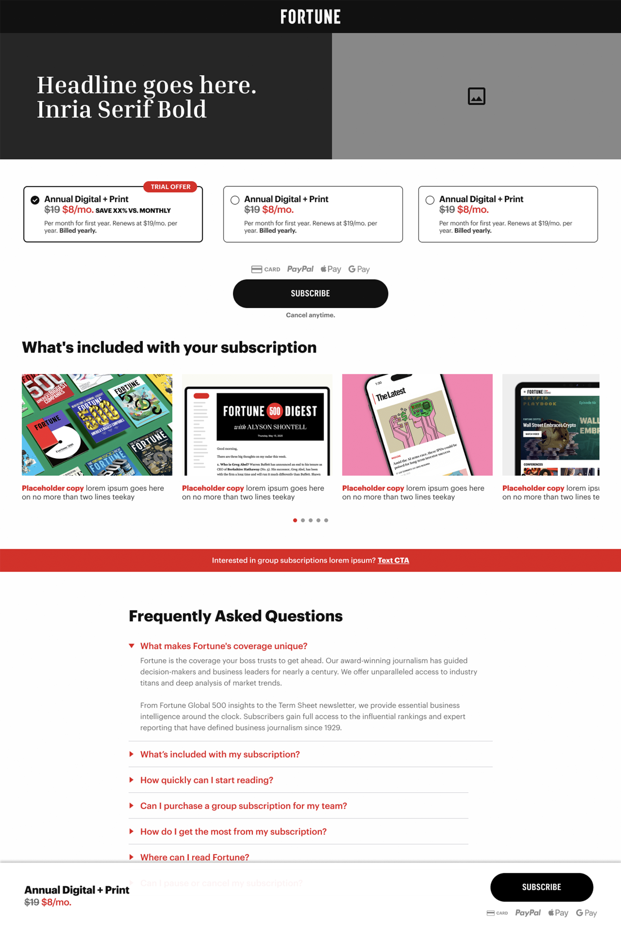
Figma template
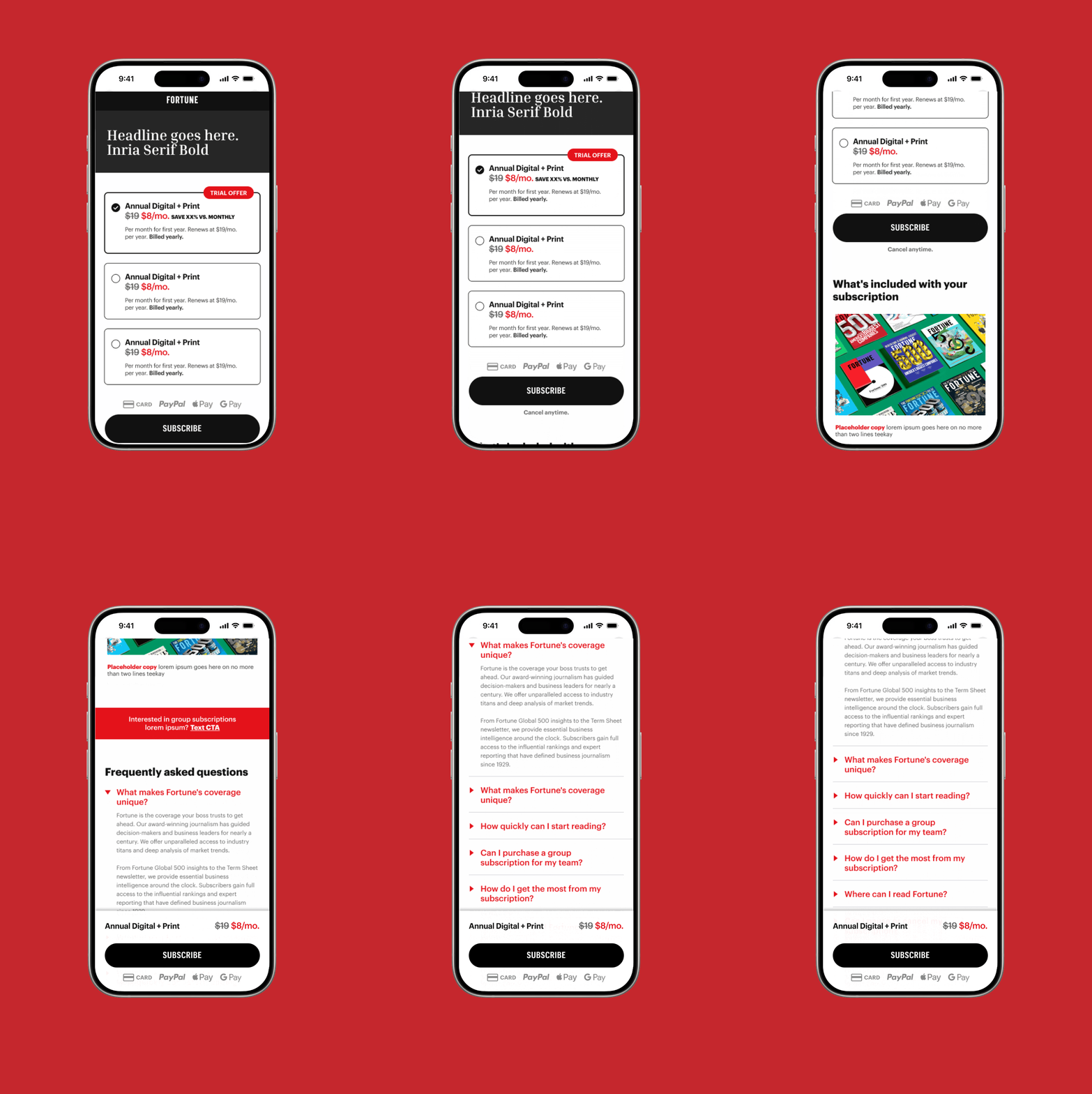
Mobile prototype with bottom bar animation